Buddies for Paws brand guidelines
Logos, colours, typefaces and all other good stuff is available here to help you keep things looking Buddies for Paws approved. Just follow the guidelines, and you’re all set.
If you have questions or are not sure about something give us a shout here. We’re happy to help.
Master logo
This is our master logo. It should be used as often as possible and is available in all BFP primary colors, including black and white.
Please use the colored versions responsibly and refer to the color guidance page for detailed instructions. Detailed below is guidance on clear space.
If in doubt, give it more room, never less.
Submark logo
This is our submark. We use it in situations where the master logo might be too large, the text becomes unreadable, or space is limited. It’s also ideal for mobile website headers, among other compact applications.
Detailed below is guidance on clear space. If in doubt, give it more room, never less.
Color palette
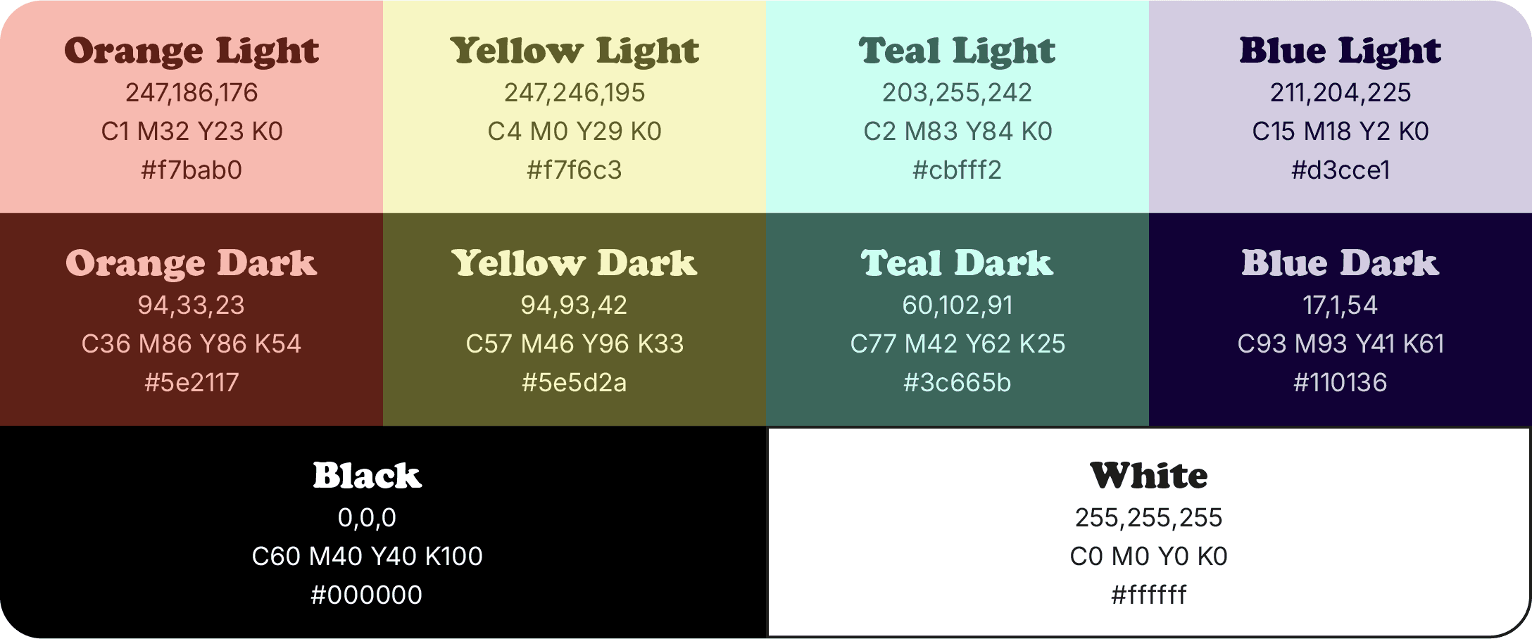
This is the full BFP palette. We don’t lead with a specific color way—our approach is flexible and adaptable. Our primary palette includes colors that should always be featured in any asset. Supporting colors should never appear on their own, and the master logo or submark should not be presented in these supporting colors. However, they are suitable for use in UI elements, infographics, iconography, and more.
Primary colors

Secondary colors

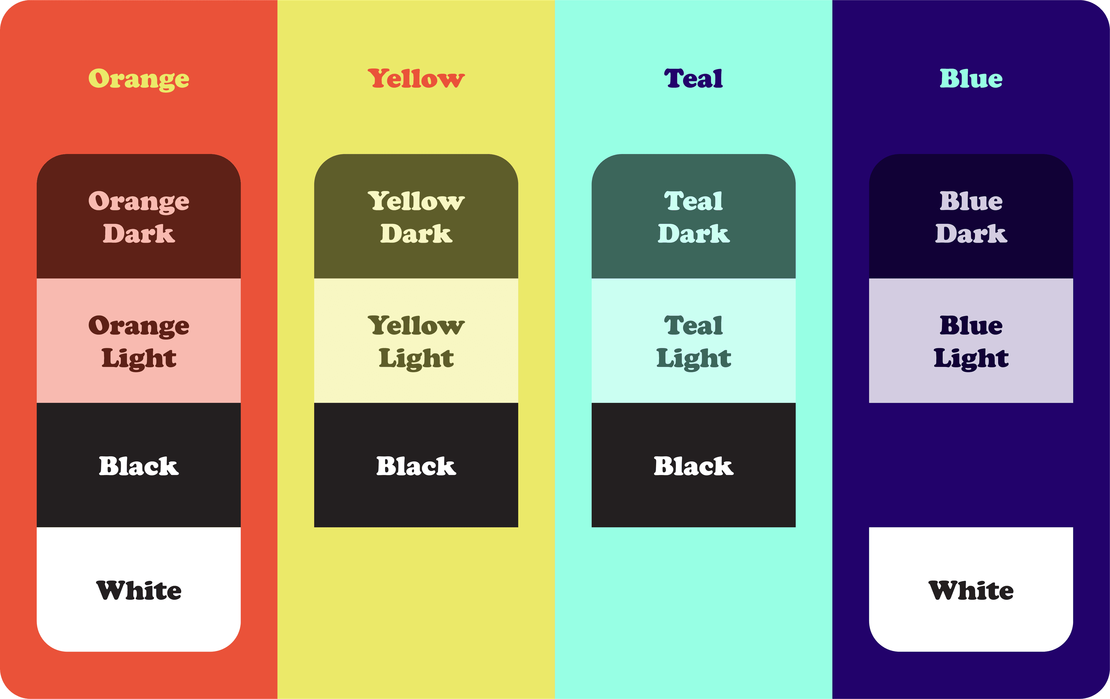
Color combinations
Use only the approved color combinations shown here to ensure legibility across all touchpoints and assets. Some colors pair well with white— others don’t. Our goal is clarity and consistency. If a combination looks off, it probably is.

Typography
We have two typefaces:
Cooper Std Black and Inter.
Cooper Std Black should be used for headlines, titles, CTAs, and any impactful text.
Inter is reserved for body copy, supporting text, footers, terms and conditions, and similar content.
Cooper Std Black
fonts.adobe.com/fonts/cooper-black